Is it possible break Latin America down into groups of similar countries?
I've been playing with gapminder again this week and I thought I'd try and do it. The shared traits across the whole region are numerous: a shared lanuage (or Portuguese which is closely related to Spanish), a shared cultural sphere for music and television as well as a shared iberian cultural inheritance, very high economic inequality coexisting with relatively high life expectancies and standards of living, corrupt governments, large informal sectors of the economy, high population growth rates, and many other factors.

Within the bloc however the range is significant. Argentina is a the classic positive outlier, with a higher per capita GDP than Spain up until the 1960s. Meanwhile Central America seems to be able to find no end to its troubles. I was hoping to be able to group the main body of Latin American countries (excluding Carribean countries that speak languages other than Spanish and Cuba because it is so unique) into three or four groups based on similarities among the members. However, it has proven very difficult to definitively separate out the groups. This map shows my proposed groupings.


The group that shows itself most clearly is that of the least developd Latin American countries. The "bass ackwards" group is made up of the 5 most isolated countries; the three larger Central American states of Guatemala, Honduras, and Nicaraqua, and the two landlocked South American countries Bolivia and Paraguay. In all areas these five countries fall well behind the pack. While poverty exists in all Latin American countries, with thier extremely unequal wealther distributions, it is by far most actute and prevalent in these 5 countries, one of which I have the pleasure to temporarily call my home.
The next group is also fairly distinct; it is made up of the coastal Andean countries Peru, Ecuador, and Colombia plus El Salvador, the DR and Brazil. This is your Latin American heartland, the midwest of the South, if you will: moderately industrialized, moderately poor, moderately democratic, with a moderately high HDI and life expectancy. Some, like Brazil have rapidly expanding economies, but all have serious issues that must be resolved before they join the group of developed states.
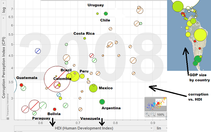 a note about gapminder:
Gapminder is an amazing tool for visualizing information about the countries of the world. It has, however, some very frustrating limitations with the interface. Many of the useful ways you can modify an excell graph, such as choosing colors for each data set, or selecting a specific range to display, are not avaliable in the gapminder application for some reason. This software came out more than five years ago, and why it has not been improved is beyond me. You will notice that I have made many modifications to the images in ms paint. In the year, 2012 for pity's sake.
Generally the data avaliable is from the most reliable sources. We should never trust stats to tell the exact truth about any one place at any one time. We can trust them, with a grain of salt, when they show us broad trends over many years. One things I appreciate most about Gapminder is that it brings together so many data sets, and that I don't have to go importing each set into excell myself. That said, I wish it were easier to manually update data sets. Post-financial crisis numbers ought to be avaliable by now.
And to anyone that got this far, congratulations.
For everyone else, I'm sorry about all the numbers stuff, I promise to return to my usual wistful ruminations about the beauty of the countryside proximamente.
You are way more guapo than I am when it comes to informative posts. impressed.
ReplyDelete